
Sunday, March 28, 2010
New Work

I'm working on adding a lot more collagey elements to my work. In this piece I really liked adding the graph paper, masking tape, and stamp from an old envelope.
Friday, March 26, 2010
"Aspergers is the new gay"

Sample 1

Sample 2

Part of R.M. Vaughan's 'Buttons for Toronto artists' series
I read this quote by R. M. Vaughan in his Globe interview with filmmaker Noah Baumbach today.
So funny I had to make a lettering sample out if it.
p.s. Looking forward to seeing Baumbach's Greenberg.
p.s.s. R.M. Vaughan has made a great series of "Buttons for Toronto artists" with quotes including
"Blame the Drake" and "Please stop talking about New York".
Just had to include a pic of those too.
Tuesday, March 23, 2010
Nate Williams + Illustration Mundo

Nate's Caderas pillow (means wide hips!)
from his company Hola Amiga

Lion and Molecules pillow

EFII podcast on Illustration Mundo site
Lucky me!! I just won a gorgeous pillow from Nate William's Give away on his blog. All his designs are so great - it was hard to decide which one to choose - but I finally settled on his Caderas design.
I have written about Nate Williams in previous posts. He is a very talented illustrator + the creator of Illustration Mundo: a wonderful site which is filled with lots of resources for illustrators plus a great search engine for art directors to find exactly the artist to fill the job.
(If there are any young illustrators out there reading this post --- I encourage you to join the site - pronto!)
Nate has a very interesting story in that he once worked crazy hours as a programmer in California before realizing he was unhappy and chucked it all to move to Buenos Aires to lead a more rich + fulfilling life.
You can hear all about his journey here in this EFII podcast.
Highly recommended listening. Very inspirational.
Monday, March 22, 2010
Inspiration! Chronicle Books Blog

Gasp! (as swiss miss would say)
Have just discovered The Chronicle Books Blog!!
Chock full of great stuff.
Really liked designer Suzanne LaGasa's recent post on Creative Projects for Rainy Days. Includes lots of suggestions for kick starting your creativity.
New Work: Indianapolis Monthly

My Illo done for Indianapolis Monthly

Inspirational piece from the CUTCO cook book published in 1961.
The top image is my illo for the Food section of Indianapolis Monthly.
The writer lamented the fact that when he tried to impress his friends by making cassolet he didn't know it took 5+ hours!
The Art director Margo Wininger requested a retro feel so I used a limited palette of black with yellow accents. This combo was used a lot in the 1950s + 1960s - have included an inspirational sample!
ps. I always find it kinda of ironic that this 1 colour technique was developed due to budget restraints with printing but we now use this limited palette by choice because it looks good!
New Work: Fitness magazine

A new piece for Fitness magazine for an article on how to sleep better.
This piece illustrates the technique of taking a bath at night. I based it on my own bathroom. :-)
Art director Tricia McGuinty Boyles.
Sunday, March 21, 2010
You are not a Gadget
Very good interview on the Sunday Edition with Jaron Lanier author of You are Not a Gadget. He discussed the de-humanizing impact of social media. Argued that Facebook is very restrictive for kids - does not allow them room to reinvent themselves. Also expanded on the idea of digital Maoism: a term he has coined.
Very thought provoking (especially for people still attempting to make a living off their creativity)
Very thought provoking (especially for people still attempting to make a living off their creativity)
Saturday, March 20, 2010
A Prophet (Un prophete)

Saw this on Friday.
Tahar Rahim was great in the lead role.
Directed by Jacques Audiard.
I liked the poster too - very Nouvelle Vaguish with the bands of color and b+w photo.
Thursday, March 18, 2010


These are the people in my neighbourhood Part 6: MjoLK

Co-owner John Baker
He looks quite Danish - yah?

Gorgeous website by design firm Sali Tabacchi

Co-owner Julie Daoust
She looks quite Norwegian - No?

Shop Exterior
Yesterday I took a field trip to mjoLK: a wonderful new space in the Junction which just opened last December. MjoLK (which means milk in Swedish) is a gorgeous shop dedicated to all things Scandinavian - run by design enthusiasts Juli Daoust and John Baker. (The pair are actually not Scandinavian - but you'd never know that from their groovy haircuts and impeccable taste!) The shop has a corresponding beautiful website which was designed by Sali Tabacchi here in Toronto. Really gorgeous and definitely worth a visit.
Wednesday, March 17, 2010
Press: Arren Williams

Arren Williams interviewed me for the 5 quick questions section of his blog today. Arren is a stylist, editor and trend reporter. He writes regularly for Canadian House and Home + The National Post plus this winter he was featured in big ads on the sides of buses for the IDS show. (Just had to mention that Arren!) :-)
You can read the interview here.
Saturday, March 13, 2010
Johanna Schneller's advice for the Oscars
"Stop courting the audience that doesn’t care about you, and stop alienating the audience that does."
I thought this was great.
I thought this was great.
Friday, March 12, 2010
And the Winner of the print is...
Melinda Josie!
Thanks to everyone who submitted a comment. You input was most appreciated.
I'll be having another give away later in the year so stay tuned.
Thanks to everyone who submitted a comment. You input was most appreciated.
I'll be having another give away later in the year so stay tuned.
My Mom's Birthday

Today is my Mom's birthday. She died in 1998 and I miss her.
She was incredibly supportive - When I was young she made sure I had a steady supply of crayons, markers and doodle art kits and later on she was unfailingly encouraging of even my most zany artistic pursuits.
My mom was a nurse and in 2001 the Warren Design Group asked me to illustrate an Anniversary book for the Children's Hospital of Los Angeles with a special focus on nursing throughout the ages. They sent me all sorts of groovy reference material of former nurses' uniforms and asked me to draw a uniform from each decade placed on a mannequin. Above is a sketch of the one from the 1960s which is based on a uniform that my mom wore.
Tuesday, March 9, 2010
My Apartment

For years I've painted almost every wall in my apt grey.
It makes colours like pink, yellow and orange really POP.
On wall: My Penguin book cover silk screen print

I like the look of these three IKEA Ringun rugs together - juicy.

Some art on display in the stairway.
Large painting by Shannon Greene.
Illustration by Carey Sookochef
Alphabet legs and n is for novel prints by me.
ps. Yes yes I'm aware the Keep Calm poster is so "OVA!"

One of my favorite pieces: A decoupage plate by John Derian

The needlepoint shoe pillow I designed and stitched

My office
On wall: Franny goes to school and Large Red Tea pot

My map drawers (Essential for any printmaker and an unwelcome sight for any movers!):-)

Shelf from a former shoe factory purchased at Chair Table Lamp

Day bed in office to lie on when in need of inspiration
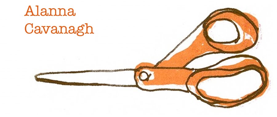
On wall: My Big orange scissors print

Vanity table in bedroom
On wall: My Room of One's own silk screen print
Designer and Style writer Arren Williams has asked me to submit some pics of my apt for his 5 Quick Questions series so this weekend I held a little photo session with my apt.
Press: Style at Home Day on City Line

Samantha Pynn in the kitchen

Close up of my birdie print
Today my birdie print was featured on City Line in Sam Pynn's feature on 'counterscaping' for your kitchen. Sam cited the legendary British Designer David Hicks as inspiration for her segment.
As she explained - Hicks, who coined the term tablescaping, was a master at artfully arranging everyday objects, art, and other tchochkes into beautiful groupings and passionately felt that it wasn't important how inexpensive the objects were, but the care + feeling with which you arranged them.
ps. This birdie print is available framed and unframed in the silk screen print section on my website.
Friday, March 5, 2010
These are the people in my neighbourhood Part 5

Two new Shops: Art History and The Melissa

Illustrator Ian Phillips with his "Little Artist Paint set" find!

Entertaining and Non poisonous!

From Ian's website
I love how he has recreated these 'old timey' end papers.

One of Ian's illos. I like the 'thumbprint' texture.
Took a little field trip on Queen West with fellow Illustrator Ian Phillips and discovered 2 new(ish) shops: The Melissa and Art History. As explained in Now magazine
the former is textile designer and artist Melissa Levin’s clearing house for her ample 30-year-old collection of retro fabrics, board games and other kitschy, collectable knick-knacks.
Art History is a collaboration betweenn gallerist Katharine Mulherin and Niki Boghossian, who curate found furniture, housewares and small original artworks. Both are full of great stuff and definitely worth a visit.
Have also included 2 images from Ian's website. His 'old timey ness" fits right in with the feel of these two shops.
ps. Hey Shane when are coming to visit Toronto?!! :-)
Thursday, March 4, 2010
Win a print!

Recently Tina Eisenberg of swiss miss used crowd sourcing to decide on a name for her soon-to-be-born son! She called the contest "Help name Swiss Mister" - and the winning choice was Tilo.
Inspired by Tina's technique (and general chutzpah) I am now asking You Dear Reader, to weigh in on the new print I'm working on.
Do you prefer the Orange + Blue or Pink + Black combination?
To be eligible to win a t is for tap dance print - let me know your colour preference - and leave a comment on this blog post by Thursday March 11th.
A winner will be chosen at random on Friday March 12th. (My mom's birthday)
Thank you for your input and good luck!
Wednesday, March 3, 2010
New print in progress: t is for tap dance

My t is for tap dance screen

My ink and squeegees posing against a cozy winter backdrop

Mixing the pink ink

Taping the screen
(to block out the areas which you don't want to show up on your print)

Doing the first pass

Layer one flower fabric

Inking for the second pass

Ta da! Print with 2nd layer

Experimenting with an orange skirt

Inking the screen with blue

Ta da again!
I was able to finally carve out some time on the weekend to begin work on my new t is for tapdance print. It is the next in my alphabet series which includes n is for novel, m is for mask and s is for swing.
Above I've included photos of the whole inky process. It was very snowy last weekend which made the screening an extra cozy experience.
Note: I'm still in the experimental stage of creation and have not settled on colours for my final edition of prints. I'll be asking for reader input on this. Stay tuned!
Subscribe to:
Posts (Atom)


