Monday, March 30, 2009

New Website in progress


I'm working on a new website which will display both my illustration and fine art.
Am using Other People's Pixels which provides wonderful customizable and content manageable templates for artists.
I can't wait to get it up!! ETA = 3 days.
Then... a big glass o' wine.

Friday, March 27, 2009

New work: As You Like It Poster


Initial black and white sketch


Sketch and 1st colour idea for a poster I'm working on.

Posters: The most Artful form in Commercial Art


Am working on some poster samples so have sought inspiration from my book Masters of Poster Design by John Foster. Great book including dozens of really incredible posters.
One of my faves above: a stunning theatre poster by Dave Plunkert of Spur Design.. who was clearly influenced by Saul Bass.

Monday, March 23, 2009

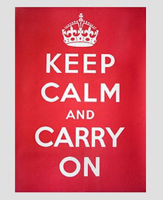
A response to the Keep Calm and Carry on Posters


The folks at Modern Toss in the UK have come up with a new slogan in keeping with the current economic collapse. Apologies to any delicate eyes reading this post!

Sunday, March 22, 2009

Children's Books by Graphic designers Part 2


David over at SWIPE books has started a blog and it's full of all sorts of fun and idiosyncratic descriptions of his favorite books and designers. Compels one to make an order! Here is his description of Bob Gill who I posted about last week.

Bob Gill is one of the most influential figures in post-war graphic design and has the kind of biography that could easily be reimagined as a sitcom. Born in Brooklyn in 1931, Gill put himself through art school playing piano in the Catskills. In 1962, in Austin Powers’ London, he co-founded Fletcher / Forbes / Gill which today is known as Pentagram; in ‘67 he designed the first Beatles album cover for Apple Records; in ‘75 he directed a hardcore porno (Double Exposure of Holly) in New York; in ‘79 he created Beatlemania for Broadway (1006 performances); and in ‘81 he published one of the best-selling graphic design books of all time, Forget all the rules you ever learned about graphic design. Including the ones in this book. (unfortunately long out-of-print). And somewhere in between he created wonderful, whimsical children’s books, alone and in collaboration with Alastair Reid, the renowned translator of Borges and Neruda.

Saturday, March 21, 2009

Jillian Tamaki: Courageous


Fatal Foibles

Yes indeed to social networking!
I've admired Jillian Tamaki's work for several years now.
The self portrait and "Fatal foibles' above are taken from a cartoon she did recently for the Guardian.I thought them both funny and wonderfully honest.

Wednesday, March 11, 2009

NYC Day 6 Visit to Pentagram

NYC Day 6 John Derian


Today visited one of my all time favorite shops in NYC: John Derian Dry Goods.
John Derian is a decoupage artist who makes wonderous pieces out of very quirky ephemera. My favorite is his "relationship series" of plates which were made from some poignant correspondence he found in the Algonquin Hotel.
I just love the note : "Sorry to appear insistant but I must have my trinkets. This is the last chance." Hilarious and very quirky.

The store also carries linocuts by the artist Hugo Guiness.
They are displayed to maximum effect in a variety of frames made of different colours and shapes. The effect is fantastic and is inspiration for my next show.


Monday, March 9, 2009

NYC Day 5: Needlepoint with Shane Harrison


Day 5 of NYC I kicked back with illustrator and fellow needlepointer Shane Harrison for an afternoon of stitching, and coffee (and ok bitching too). First stop - Rita's Needlepoint shop at 150 East 79th St. for stocking of wool! Next stop = the wonderful Housing Works bookshop on Crosby street in SOHO. Highly recommended for extended lingering!
For my needlepoint design I used a drawing I had quickly sketched of one of those "Victorian pointing hands". (I don't know if there is a more technical terms for these hands. Please write in if you know! Thanks) I liked the energy in the drawing and thought it'd fit nicely as an eye glass case. Above is the drawing and my progress so far.
ps. I'm aware needlepoint sounds extremely 'Granny' but it does wonders for the brain by inducing slow theta waves (or something like that) which lead to a deeply relaxed state - so there!

NYC Day 4: DUMBO Flea market (+Paul Rand+ Bob Gill)


Whoo! This ship is upside down!! I thought a good metaphor for the economy right now.

Went to DUMBO (Down Under the Manhattan Bridge Overpass) today for the weekend Flea Market.
Amongst the "wares" I saw noticed a strong 'circus aesthetic' going on: lots of very ornate letters, and Victorian images with lots of swirlys. Here are 2 examples: the Brooklyn Flea bag and turned over ship tshirt both from Loyalty and Blood.

Also loved the very witty tshirts made by Brooklyn based Miss Wit.

Attached is my fave design:
(The expression is more LA than NYC but still quite great!)


Afterwards went wandering through a wonderful book shop on York St.
where the huge selection of kid's books were clearly chosen with their hipster designer parents in mind. Here are pics of two of my faves: I know alot of things by Paul Rand and
A balloon for Blunderbuss by Bob Gill. I love both these books. The illustrations are exceptional: simple yet very sophisticated.


Love this ship!

Saturday, March 7, 2009

NYC Day 3: Lotta Jansdotter Workshop

Took part in a surface printing workshop today in Brooklyn with well known textile designer Lotta Jansdotter. Lotta is originally from Aland a small island near Sweden but now lives in Boreum Hill in Brooklyn. I have long admired her economical designs and wonderful colour combinations. She was a fantastic teacher and very fun.


Lotta talking about her inspiration.


Lotta's "Tang' design.


The pear apron I made using a stencil technique.
One of the biggest lessons I took from the workshop was that simple shapes can look very sophisticated when repeated.

NYC Day 2 Muji, Great packaging, Din din

Went to Muji. I want one of everything.

Then saw some great packaging in Jublilee market.
Love these Republic of Tea labels with their directives- especially the Get it going one. Very bold idea!
Must check to see who designed them.


Then dinner with lovely Scott.

Thursday, March 5, 2009

Paula Scher: Make it Bigger


Am currently reading Make it Bigger by Paula Scher. Is fantastic.
I particularly enjoy her diagrams, charts and whimsical genealogy trees. As she explains at a certain point in her career ( around 1985) the act of concocting complicated systems of useless information became an important and personal part of her design vocabulary.
For me she is the Queen of Data Visualization.

ps. glass o wine, apartment in nyc and paula scher.
doesnt get much better than that.

Day 1 New york


i arrived in new york this evening.
staying in a great space in the financial district.
i heart new york.

ps. this cover is by one of my all time fave illustrators Miroslav Sasek.

Tuesday, March 3, 2009

New work: Pink room


This is the completed illustration of the daybed room. For colour inspiration I again looked to the Madeline books which were mainly coloured in a duotone: usually black + 3 different shades of yellow. I chose to use a brown line and 3 shades of pink for a vintagey look.

Sunday, March 1, 2009

Teaching Silk screening


On Friday I taught silk screening to kids in grades 4-8 for the Arts Alive Day at Market Lane Public school. I made a screen based on Shepard Fairey's famous Hope poster. The kids were fantastic and they really enjoyed inking the screen, pulling the squeegee and producing a poster of Obama. yay.